An SEO-friendly navigation menu helps visitors find the right page quickly and gives search engines clear paths to discover, crawl, and understand important content. The strongest navigation systems are simple enough for users, consistent across templates, and built with crawlable HTML links rather than hidden or script-dependent elements. When navigation is planned as part of site architecture, it can improve internal linking, clarify topical relationships, and reduce the risk of valuable pages being overlooked.
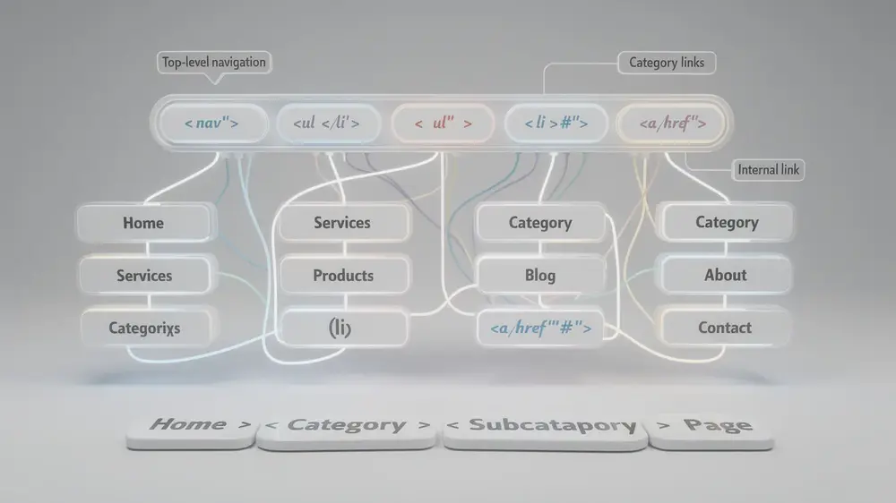
- Use crawlable HTML navigation with standard elements such as nav, ul, li, and a href links so search engines can access important pages without depending only on JavaScript rendering.
- Keep the primary menu focused on the pages that matter most to users and the business. Many sites perform better with a small number of clear top-level categories, but the ideal number depends on site size and search intent.
- Write descriptive menu labels that match the language users expect. Clear labels help people make faster decisions and give search engines better context about destination pages.
- Do not treat mega menus as automatically good or bad. They can work well for large websites when they are organized, crawlable, accessible, and not overloaded with low-priority links.
- Review navigation with data from crawl reports, Google Search Console, and user behavior tools before and after major changes. Menu changes should be tested, not treated as guaranteed ranking fixes.
What Is an SEO-Friendly Navigation Menu and Why It Matters
An SEO-friendly navigation menu is a consistent set of internal links that helps users and crawlers move through a website in a predictable way. It usually appears near the top of the page and points to the most important sections, category pages, service pages, or content hubs. Good navigation is not just a design feature. It is one of the first signals that shows how a site is organized.
At a technical level, the menu should rely on semantic HTML and accessible links. Elements such as nav, ul, li, and a href make the structure easier for browsers, screen readers, and search engine crawlers to interpret. JavaScript can still be used for interaction, such as opening a dropdown, but the important links should remain available in the HTML whenever possible.
Navigation also works as a visible layer of your internal linking strategy. Links in the main menu often appear across many pages, so they can influence which sections receive more attention from crawlers and users. This is why menu choices should reflect real content priorities rather than internal team preferences.
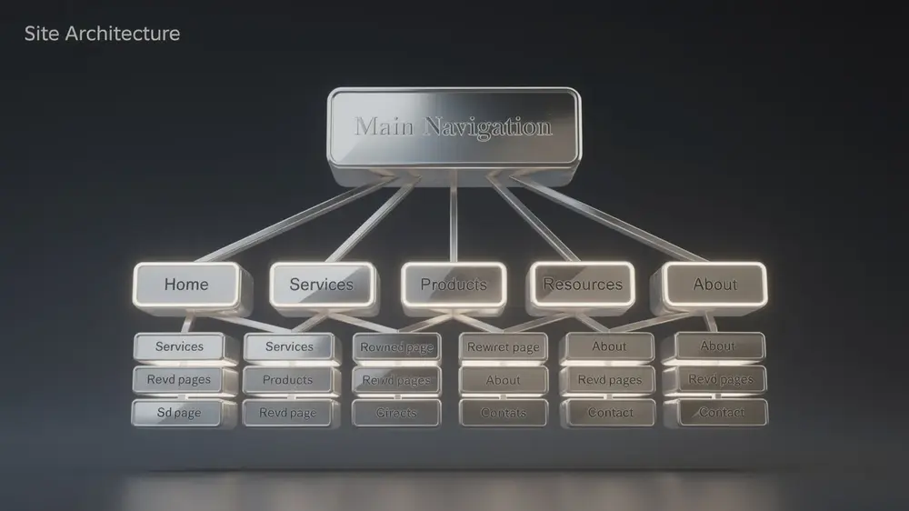
The Anatomy of Navigation Menu Components
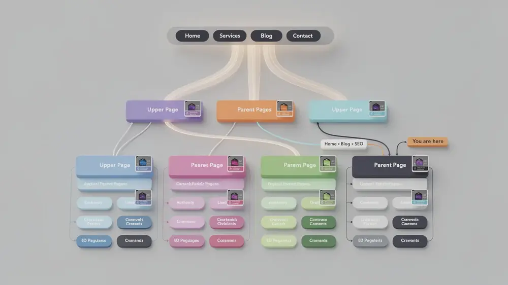
A complete navigation system may include a primary menu, dropdown submenus, breadcrumbs, footer links, contextual links, and sometimes a site search function. Each element has a different job. The primary menu should guide users to the most important areas. Breadcrumbs should show location within the hierarchy. Contextual links inside the body should connect related pages where the relationship is useful to the reader.
How Navigation Differs from Other Site Elements
Banners, sidebar widgets, and promotional blocks often change by campaign or template. Primary navigation should be more stable. It gives users a consistent way to move through the site and gives crawlers repeated access to high-value pages. When navigation changes too often or appears differently across similar page types, it can create confusion for visitors and make site structure harder to evaluate during SEO audits.
How Navigation Menus Impact Crawling, Indexing, and User Experience
Navigation affects SEO because it shapes how pages are discovered and how easily users can reach them. A page that is linked from a clear, consistent menu is easier to find than a page buried several clicks deep with no obvious path. This does not mean every page belongs in the main menu. It means the menu should point to the right hubs, categories, and commercial pages so users and crawlers can reach deeper content through a logical path.
The Crawler Perspective: How Bots Read Navigation
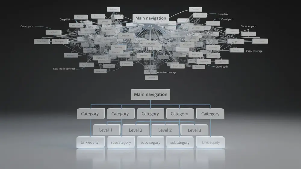
Search engines discover pages by following links. When a menu uses standard HTML links, crawlers can follow those paths and identify which sections are central to the website. This can help priority pages get crawled more consistently, especially on larger sites where crawl efficiency matters.
Navigation also affects how internal authority and context move through a site. A homepage or high-authority hub page that links to key categories sends a stronger signal than a page with no clear internal path. Supporting elements such as breadcrumb navigation can reinforce the same hierarchy by showing where each page sits within the site structure.
User Experience Signals and Search Performance
Clear navigation helps users complete tasks faster. A visitor who lands on a blog post may want to compare related guides, find a product category, or move back to a parent topic. If the path is obvious, the session is more likely to continue. If the menu is vague, overloaded, or hidden in an unexpected place, users may return to search results or use another site instead.
It is better to think of navigation as part of overall page experience rather than as a shortcut to one specific ranking factor. A useful menu can improve engagement, reduce friction, and help users reach content that satisfies their intent. Those improvements support SEO because they make the website more helpful and easier to understand.
Building an Optimized Navigation Menu Structure
Choosing and Organizing Top-Level Categories
The best primary menu starts with user intent. Before choosing labels, review the main reasons people visit the site. For an SEO education site, users may look for beginner guides, technical SEO, content strategy, tools, and case studies. For an ecommerce site, users may expect product categories, deals, brand pages, support, and account access. A menu should match those expectations.
Many websites benefit from keeping top-level navigation to a focused set of choices, often around five to seven items. This is not a strict rule. A small service business may need fewer items, while a large marketplace may need more. The goal is to prevent the primary menu from becoming a dumping ground for every page. If a link is not useful to a broad audience or does not represent a major section, it may belong in a hub page, footer, breadcrumb trail, or contextual link instead.
Labels should be specific, familiar, and aligned with search intent. A label such as “Technical SEO” is clearer than “Solutions” if the page contains technical SEO guides. A label such as “Casino Reviews” is clearer than “Explore” if users are looking for review content. This is where navigation and site architecture strategy need to work together. The menu should reflect the same hierarchy used in your content hubs and category structure.
Technical Requirements for Crawler Access
A crawlable menu should use standard links that remain available in the page source or rendered HTML. If a menu only appears after a user interaction and the links are injected entirely through JavaScript, some crawlers and audit tools may not discover those links consistently. This can make important pages look less connected than they actually are.
For most websites, the safest approach is to provide a basic HTML link structure first, then use CSS and JavaScript to improve presentation and interaction. Mobile navigation should follow the same principle. A hamburger menu can be acceptable on smaller screens, but the links inside it should still be accessible, readable, and easy to activate.
Accessibility should be part of the technical review. Menus need keyboard support, visible focus states, sufficient contrast, and readable labels. These details help users with assistive technologies and also reduce usability problems for everyone else.
Critical Navigation Mistakes That Harm SEO Performance
When Complex Menus Create SEO and UX Problems
Complex navigation is not always wrong, but it becomes a problem when users cannot tell where to click or when crawlers are given too many low-value paths. A large menu with dozens or hundreds of links can reduce focus, especially if many links point to thin, overlapping, or low-priority pages. It can also make the site harder to maintain because every navigation change affects many templates at once.
Mega menus deserve careful handling. They can work well for large ecommerce sites, publishers, and enterprise websites when categories are grouped clearly and the menu supports real user tasks. They become risky when they expose too many links, duplicate similar paths, hide important links behind scripts, or use labels that only make sense to internal teams.
Hidden navigation can also reduce discoverability. On desktop, placing all core links behind a hamburger icon may slow users down if they expect to see the main categories immediately. The SEO issue is not the icon itself. The issue is whether users and crawlers can easily access the important links.
Identifying and Fixing Crawlability Issues
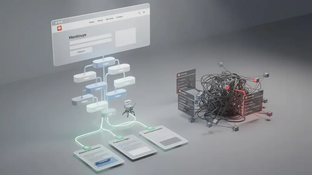
A navigation audit should check whether the most important pages can be reached through crawlable links and a logical click path. If key pages are only accessible through search filters, JavaScript states, or isolated landing pages, they may behave like orphaned content. A deeper understanding of how crawling and indexing work helps explain why this can limit organic visibility.
- Deep nesting beyond three levels can make important pages harder to reach, especially when there are no supporting breadcrumbs or hub links.
- Inconsistent menu placement across similar templates can confuse users and make the site feel less reliable.
- JavaScript-only menus should be supported with crawlable HTML links or server-rendered alternatives where important pages are involved.
- Generic labels such as “Resources,” “Explore,” or “More” should be replaced when a more specific label would help users choose faster.
- Overloaded mega menus should be reviewed for duplicate links, low-priority destinations, and categories that no longer match search demand.
Navigation issues often appear slowly. A script-dependent menu, weak category structure, or over-nested path may not cause an immediate traffic drop, but it can make crawling less efficient and make important pages harder for users to discover. Regular audits help catch these problems before they become ranking or conversion issues.
Advanced Navigation Strategies and Evergreen Principles
Using Navigation to Support Topic Clusters
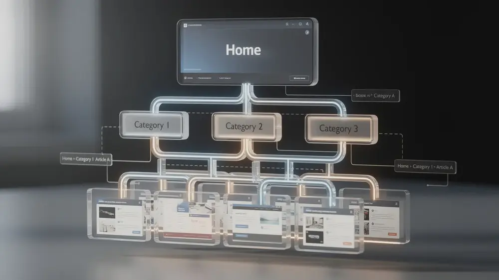
Strong navigation does more than link to popular pages. It helps show how topics are grouped. A content hub should link to its most useful supporting pages, and those supporting pages should link back to the hub where relevant. This structure helps users move from broad topics to detailed answers without relying on the main menu for every internal link.
For example, a technical SEO hub might link to guides about crawl budget, indexing, canonical tags, redirects, and structured data. The main menu only needs to link to the hub or category. The hub page can then guide users to the deeper resources. This keeps the primary navigation clean while still giving important pages a strong internal path.
How to Test Navigation Changes
Menu changes should be measured like any other SEO change. Before updating a sitewide menu, record the current state so you can compare results later. Useful baseline checks include crawl depth, number of internal links to priority pages, indexed URL counts, organic clicks to affected pages, and click behavior on navigation elements.
After implementation, review the same data over a reasonable period. For many sites, four to eight weeks is a practical window for early comparison, although larger sites and competitive queries may need longer. Look for changes in crawl activity, impressions, clicks, and user paths. A navigation update should make important content easier to reach, not simply add more links to every page.
Why Navigation Principles Stay Relevant Across Algorithm Updates
Search systems evolve, but websites still need clear paths between pages. A well-planned menu helps search engines discover content, helps users understand where they are, and supports a clean internal hierarchy. These principles remain useful because they are based on accessibility, crawlability, and user intent rather than short-term ranking tactics.
Navigation also supports trust. A site that is easy to move through feels more professional and transparent. Users can find important sections, compare related resources, and understand how content is organized. This is closely connected to the fundamentals of technical SEO, where site structure and crawl access create the foundation for stronger organic performance.
Practical Navigation Audit Checklist
Use the checklist below before making major navigation changes. It helps separate evidence-based improvements from assumptions.
- Review priority pages: Identify the pages that support key user journeys, organic traffic goals, and business outcomes.
- Check click depth: Confirm that important pages are reachable within a reasonable number of clicks from the homepage or relevant hub pages.
- Run a crawl: Compare discovered URLs with your sitemap and look for orphan pages, broken links, redirect chains, and duplicate paths.
- Test JavaScript dependence: Crawl the site with and without JavaScript rendering to see whether important menu links disappear.
- Analyze Search Console data: Review impressions, clicks, indexing status, and crawl activity for pages affected by navigation changes.
- Check mobile usability: Make sure menu items are readable, tappable, and accessible without forcing users through unnecessary steps.
- Validate accessibility: Test keyboard navigation, focus states, contrast, and screen reader behavior for dropdowns and expanded menus.
- Measure after launch: Compare crawl depth, internal link counts, organic clicks, and user paths after the new structure has been live long enough to collect meaningful data.
Navigation changes should be treated as a testable SEO improvement. Before simplifying a menu, record current crawl depth, internal link counts, indexed pages, and organic performance for priority sections. After the update, compare the same metrics over time. This approach gives teams evidence instead of relying on assumptions about which menu structure will perform best.