
Mobile SEO has moved from a supplementary consideration to the primary framework Google uses to crawl, evaluate, and rank websites, with between 50% and 70% of all search queries now originating from mobile devices. This guide covers how mobile-first indexing works, which technical and usability factors carry the most ranking weight, and how to identify and fix the errors most likely to suppress visibility in mobile search results.
- Google ranks all websites based primarily on their mobile versions, so a poorly optimized mobile site affects rankings across every device.
- Core Web Vitals metrics (LCP, INP, and CLS) carry direct ranking weight and are measurable through PageSpeed Insights and Google Search Console.
- Responsive design with a single URL structure is the recommended approach, as it avoids duplicate content issues and keeps link equity consolidated.
- The most common mobile SEO errors include content parity gaps, viewport misconfiguration, undersized touch targets, and uncompressed assets.
- Treating mobile as the primary user experience from the start, rather than adapting from desktop, produces more durable results as Google’s ranking criteria continue to evolve.

What is Mobile SEO and Why It Matters for Modern Search
Mobile SEO is the practice of optimizing websites specifically for smartphones and tablets, with the goal of improving both search engine visibility and user experience on smaller screens. It covers responsive design, fast loading speeds, and touch-friendly interactions that make a site genuinely usable on a mobile device, not just technically accessible.
Understanding Mobile-First Indexing and Its Impact on Rankings
Google now crawls and ranks websites based primarily on their mobile versions rather than their desktop versions. This shift, known as mobile-first indexing, means that if your mobile site is slow, poorly structured, or missing content that appears on your desktop version, your rankings across all devices can suffer. Mobile optimization is no longer a secondary concern; it is the primary ranking signal Google uses to evaluate your site.
The scale of mobile search reinforces this priority. Between 50% and 70% of all search queries now originate from mobile devices, making mobile optimization a foundational requirement rather than an optional enhancement.
The Three Pillars of Mobile SEO: Performance, Usability, and Accessibility
Mobile SEO rests on three core areas. Technical performance covers page speed and rendering, where website speed optimization directly affects both rankings and bounce rates. Usability addresses readability, thumb-friendly navigation zones, and touch interactions suited to smaller screens. Content accessibility ensures that text and media display correctly without requiring horizontal scrolling or manual zooming.
These priorities differ meaningfully from traditional desktop SEO. Mobile optimization favors vertical layouts, compressed assets, and streamlined content presentation, all shaped by the constraints of touch-based interaction and limited screen real estate.

How Mobile SEO Impacts Rankings, Crawling, and User Experience
Mobile-First Indexing: How Google Crawls and Ranks Mobile Sites
Google’s mobile bot evaluates the mobile version of a page before the desktop version. This means the content, structure, and usability signals Google uses to determine rankings come primarily from what mobile users see. Viewport configuration, text readability, and touch target sizing all factor into this assessment. If the mobile version is stripped down or poorly configured, the entire site can suffer in rankings, regardless of how polished the desktop version appears.
Local searches amplify this further. Mobile queries dominate local intent searches, so sites with weak mobile optimization risk losing visibility precisely where purchase decisions happen most quickly.
Core Web Vitals and Mobile Usability as Ranking Factors
Three Core Web Vitals metrics carry direct ranking weight: Largest Contentful Paint (loading speed), Interaction to Next Paint (responsiveness), and Cumulative Layout Shift (visual stability). Pages that fail these thresholds, or fail Google’s mobile usability tests, face ranking penalties. Pages that meet them receive preferential treatment in mobile search results, which now represent the majority of search traffic globally.
The user experience consequences of poor mobile optimization are measurable. Pages that take longer than three seconds to load see significantly higher bounce rates. Unreadable text and difficult navigation reduce engagement, while frustrating touch interactions cut conversion rates. These behaviors send negative signals back to Google, compounding any existing ranking disadvantage.
Treating mobile optimization as part of a broader on-page SEO strategy helps address these issues systematically, improving dwell time, reducing bounce rates, and building the kind of engagement signals that reinforce ranking gains over time.
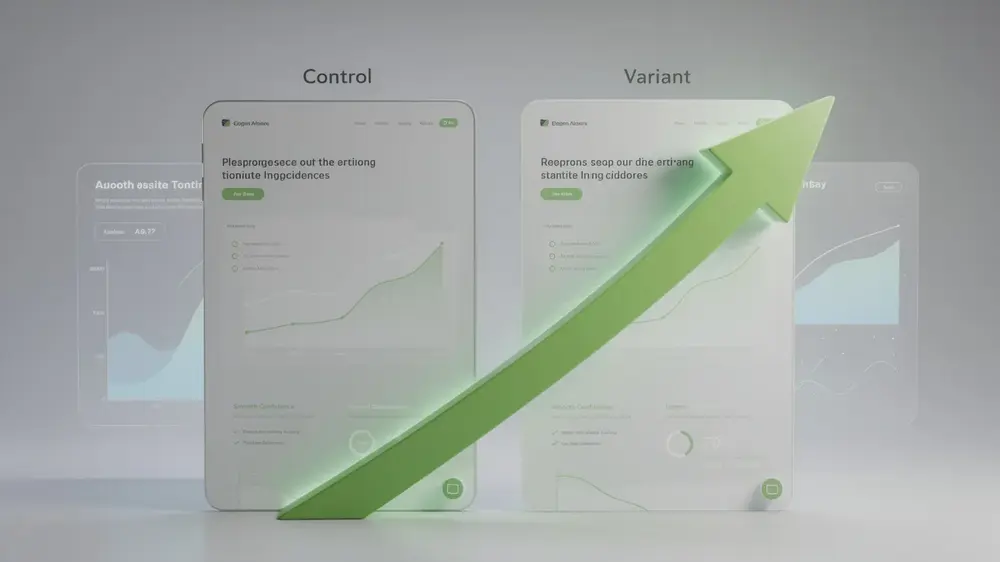
Ranking gains from mobile optimization are rarely instant. Because negative engagement signals accumulate over time, recovery after fixing Core Web Vitals or usability issues can take several crawl cycles before results stabilize in search. Patience and consistent monitoring matter as much as the fixes themselves. — Martha Vicher
Complete Mobile SEO Optimization Roadmap
Implementing Responsive Design and Technical Foundations
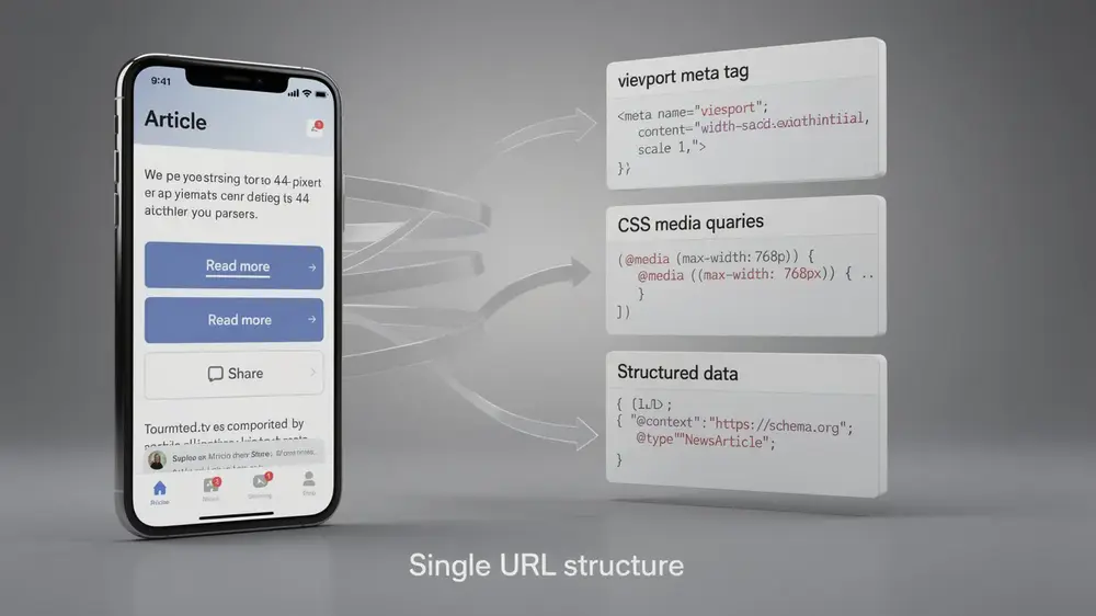
A single URL structure with flexible layouts is the recommended starting point for mobile SEO. Rather than maintaining separate mobile and desktop sites, responsive design uses a viewport meta tag and CSS media queries to adapt content fluidly across screen sizes. This approach simplifies crawling, avoids duplicate content issues, and keeps link equity consolidated in one place.
On the technical side, technical SEO configuration plays a direct role in mobile visibility. Structured data markup helps generate rich snippets in mobile search results. Title tags and meta descriptions should stay under 120 characters to display cleanly on smaller screens. Phone numbers and addresses need proper HTML formatting, and intrusive interstitials that violate Google’s policies should be removed entirely. Content parity between mobile and desktop versions is also required, since Google indexes the mobile version first.
Optimizing Page Speed and Core Web Vitals for Mobile
Load times under 3 seconds are the practical target for mobile pages. Achieving this typically involves compressing images, minifying CSS and JavaScript, deferring non-critical scripts, and enabling browser caching. Ongoing monitoring of Core Web Vitals metrics, specifically LCP, INP, and CLS, helps identify regressions before they affect rankings.
Creating Touch-Friendly Interfaces and Mobile-Optimized Content
Tap targets should measure at least 44 to 48 pixels, with 8-pixel spacing between interactive elements. Placing key actions in the bottom third and sides of the screen aligns with natural thumb reach. For local businesses, click-to-call buttons add practical value. Content readability depends on fonts of 14 points or larger, paragraphs limited to 2 to 3 lines, generous white space, and high-contrast color schemes that support vertical scrolling patterns.

Critical Mobile SEO Mistakes and How to Fix Them
Diagnosing Mobile SEO Issues with Google’s Testing Tools
Most damaging mobile SEO errors fall into five categories: content parity gaps, viewport misconfiguration, inadequate touch targets, unoptimized assets, and intrusive design elements. Google provides several tools to surface these problems before they cause lasting ranking damage, including Google’s Mobile-Friendly Test, PageSpeed Insights, and the Mobile Usability report inside Google Search Console.
Fixing Content Parity, Viewport, and Touch Target Problems
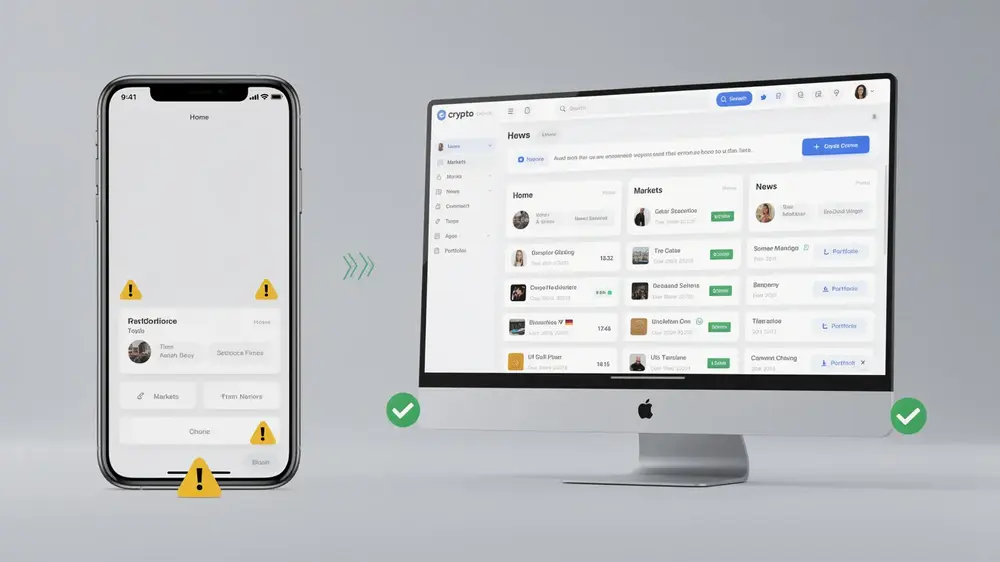
Sites that maintain separate mobile and desktop versions often serve thinner content on mobile. Under mobile-first indexing, that reduced content is what Google evaluates for ranking. The fix is either migrating to a responsive design with a single URL or ensuring complete content equivalence across both versions. Viewport errors are equally common: a missing or incorrect viewport meta tag, fixed-width layouts that force horizontal scrolling, and oversized content all trigger “content wider than screen” or “text too small to read” warnings in Search Console. Correcting the viewport meta tag and switching to fluid layouts resolves most of these. Touch targets smaller than 44 to 48 pixels, or spaced closer than 8 pixels apart, cause mis-taps that hurt dwell time. The Mobile Usability report identifies these elements, and the fix involves redesigning buttons and links with proper sizing and spacing. Writing SEO-friendly content that translates cleanly across screen sizes also reduces the risk of parity issues from the start.
Resolving Page Speed and User Experience Violations
- Asset optimization failures: Uncompressed images, non-minified CSS and JavaScript, and missing lazy loading drag down Core Web Vitals scores, particularly LCP and CLS. PageSpeed Insights diagnoses these precisely, and systematic asset optimization corrects them.
- Intrusive interstitials and cluttered navigation: Pop-ups that block content or cannot be dismissed easily on small screens violate Google’s policies and confuse users. Manual testing combined with usability reports identifies these issues. Implementing compliant designs with clear dismissal options and streamlined navigation resolves them.
Critical Mobile SEO Mistakes and How to Fix Them
Diagnosing Mobile SEO Issues with Google’s Testing Tools
Most damaging mobile SEO errors fall into five categories: content parity gaps, viewport misconfiguration, inadequate touch targets, unoptimized assets, and intrusive design elements. Google provides several tools to surface these problems before they cause lasting ranking damage, including Google’s Mobile-Friendly Test, PageSpeed Insights, and the Mobile Usability report inside Google Search Console.
Fixing Content Parity, Viewport, and Touch Target Problems
Sites that maintain separate mobile and desktop versions often serve thinner content on mobile. Under mobile-first indexing, that reduced content is what Google evaluates for ranking. The fix is either migrating to a responsive design with a single URL or ensuring complete content equivalence across both versions. Viewport errors are equally common: a missing or incorrect viewport meta tag, fixed-width layouts that force horizontal scrolling, and oversized content all trigger “content wider than screen” or “text too small to read” warnings in Search Console. Correcting the viewport meta tag and switching to fluid layouts resolves most of these. Touch targets smaller than 44 to 48 pixels, or spaced closer than 8 pixels apart, cause mis-taps that hurt dwell time. The Mobile Usability report identifies these elements, and the fix involves redesigning buttons and links with proper sizing and spacing. Writing SEO-friendly content that translates cleanly across screen sizes also reduces the risk of parity issues from the start.
Resolving Page Speed and User Experience Violations
- Asset optimization failures: Uncompressed images, non-minified CSS and JavaScript, and missing lazy loading drag down Core Web Vitals scores, particularly LCP and CLS. PageSpeed Insights diagnoses these precisely, and systematic asset optimization corrects them.
- Intrusive interstitials and cluttered navigation: Pop-ups that block content or cannot be dismissed easily on small screens violate Google’s policies and confuse users. Manual testing combined with usability reports identifies these issues. Implementing compliant designs with clear dismissal options and streamlined navigation resolves them.

Advanced Mobile SEO Strategies and Evergreen Best Practices
Advanced Techniques for Mobile Performance and Rich Results
Progressive enhancement is one of the most reliable approaches for mobile performance: load the critical content first, then layer in additional functionality for faster connections and larger screens. This keeps mobile users on slower networks from waiting for resources they may never need.
Structured data plays a significant role here. Implementing schema markup for rich snippet opportunities in mobile search results can improve click-through rates without changing your core rankings. Voice search optimization also deserves attention, since the majority of voice queries originate on mobile devices and tend to follow conversational, question-based patterns rather than short keyword strings.
Continuous monitoring through Google Search Console’s Mobile Usability and Core Web Vitals reports helps catch performance degradation before it affects rankings. Regular testing across varied devices and connection speeds, combined with A/B testing of mobile-specific design elements, keeps engagement metrics moving in the right direction.
Future-Proofing Your Mobile SEO Strategy for Algorithm Evolution
Google’s mobile-first indexing is a permanent structural shift, not a passing trend. Mobile optimization skills remain foundational regardless of how individual ranking factors change over time.
Staying ahead of Core Web Vitals evolution matters practically. The transition from FID to INP is one example of how these metrics develop, and responsive designs need enough flexibility to accommodate new device categories and screen formats as they emerge.
The deeper mindset shift is treating mobile as the primary experience from the start. Mobile user behavior, including shorter sessions, task-focused intent, and location-based needs, should shape content strategy and site architecture decisions directly, not as an afterthought to desktop design.